Thingvellir National Park (Iceland). Photo by Alex He on Unsplash
NoteThis exercise in brief
Big Question
Is younger oceanic seafloor associated with thinner lithosphere? How did crustal architecture evolve through time?
What You Will Do
You will test a geodynamic hypothesis using multiple datasets from the Palaeo Data Cube. Starting with one time slice, you will:
Map seafloor age, crustal thickness, and lithospheric thickness.
Compute global averages and distributions.
Compare oceanic versus continental regions across variables.
Extend your analysis to the entire Phanerozoic and visualize trends.
Create an animated GIF of seafloor age evolution through time.
Why It Matters
The age and thickness of the Earth’s oceanic crust and lithosphere reflect plate tectonic processes and mantle dynamics. Understanding these changes helps explain supercontinent cycles, ocean basin evolution, and even long-term climate regulation.
Your Tasks
Single Snapshot Analysis:
1.1. Load seafloor age, crustal thickness, and lithospheric thickness for one time slice using a reusable WCS URL constructor function.
1.2. Compute mean values and visualize maps with custom color ramps.
1.3. Plot a histogram of seafloor age distribution.
Exploring Relationships:
2.1. Combine the three layers into a single xr.Dataset.
2.2. Scatter plot seafloor age against lithospheric thickness.
2.3. Discuss whether the relationship matches theoretical expectations.
Deep-Time Trends:
3.1. Automate your workflow for all Phanerozoic time slices using pandas.
3.2. Separate oceanic and continental pixels using the seafloor age mask.
3.3. Plot time series of mean seafloor age, crustal thickness, and lithospheric thickness for both domains.
3.4. Interpret major trends and link them to supercontinent cycles.
Bonus — Animated Visualization:
4.1. Render each time slice as an image frame.
4.2. Compile frames into an animated GIF using imageio.
4.3. Experiment with parameters such as time order, frame rate, and layer choice.
Skills You Will Gain
Building reusable functions for WCS data access and plotting.
Working with multidimensional arrays using xarray and combining layers into a Dataset.
Storing and analyzing time-series results in a pandas DataFrame.
Visualizing maps, histograms, scatter plots, and multi-panel time-series figures.
Creating animated GIFs from raster time series.
Points for Discussion
What is the rationale behind writing functions to automate workflows ?
What does the histograms of 0Ma versus 100Ma tell us about the rate of oceanic seafloor production ?
Compare the properties of the data handling structures we usedinthis exercise: xr.DataArray, xr.DataSet, and pd.DataFrame. How are these complementary to handle geospatial layers and key stats ? Are you awayre about other structures ?
Using your knowledge about the supercontinent cycles, and the timing for formation/break-up of these supercontinents, do you see these cycles linked with the data we have ?
Step-by-step instructions
In the first part of this exercise, we focused on palaeogeography, and learned basic tools to:
Construct a Web Coverage Servive (WCS) request through a simple URL using the requests library
Access the data using the rasterio library avoiding going through a manual download
Plot the map using the matplotlib library
Understand the metadata associated with the data we accessed
Extract simple statistics from a single map (land & ocean areas)
Generalize this analysis on all available time steps
In this second part, we will follow a similar path, but we will look other maps from the same source. The idea is to have a look at other aspects of the Earth system that informs us about processes taking place in its inner layers.
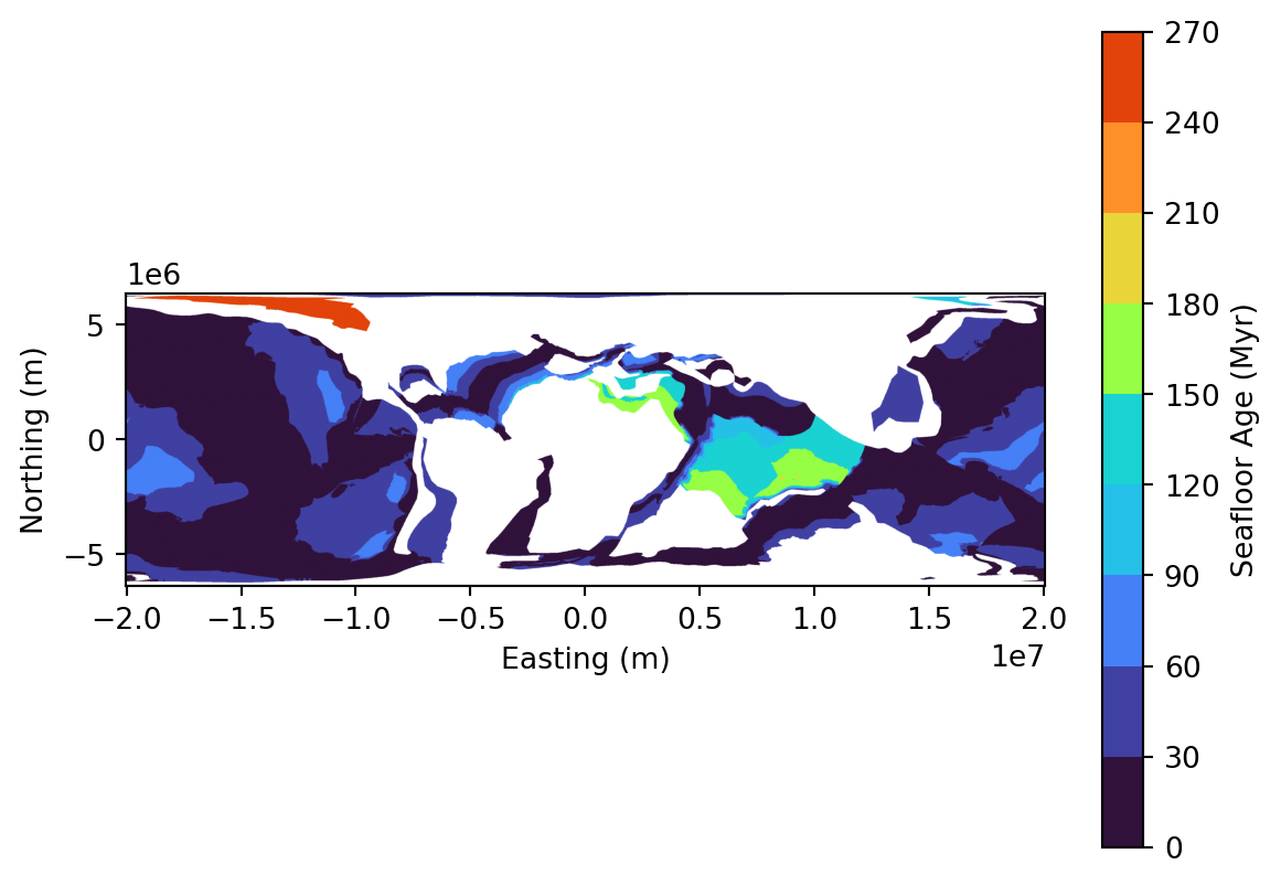
We will particularly have a look at three layers that are available through the same WCS requests which are (i) seafloor ages, (ii) crustal thickness, and (iii) lithospheric thickness.
As we did before, we will use the panalesis_atlas data sore on GeoServer, which serves data in world cylindrical equal area (WCEA), using the ESRI:54034 projection. This is done to ensure proper area calculations, as opposed to data in more common CRS such as EPSG:4326, which use degrees units.
Install libraries
This tutorial requires the following libraries:
requests
matplotlib
rasterio
numpy
xarray
rioxarray
pandas
imageio
You can check if they are installed (and check which version you have) by running:
libs = ["requests", "matplotlib","rasterio", "numpy","xarray", "rioxarray","pandas", "imageio"]for lib in libs:try: module =__import__(lib)print(lib +" is installed")exceptImportError:print(lib +" is NOT installed")
requests is installed
matplotlib is installed
rasterio is installed
numpy is installed
xarray is installed
rioxarray is installed
pandas is installed
imageio is installed
We will first load the three layers for one single age, similar to what we did in the previous part (100 Ma). You have noticed that we used the WCS url request format quite a few times. Instead of repeating the entire code every time, we can define a quick function that we can call with the correct parameters.
The idea is to simplify the next steps where we will handle multiple layers at the same time, for a given age.
CautionTask
→ Notice the function parameters order and syntax, what do you observe ?
We will use this function on our layers of interest, and see if we can plot them easily. For this, we can also create a function to load and plot the maps with a proper color ramp, using the URL, the defined color ramp and a title.
Once these two functions are defined (url constructor + plotter), it becomes very easy to call them. Just define a color ramp of your choosing and call it. Let’s focus on seafloor ages:
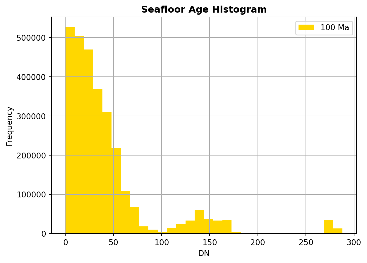
Now that we have retrieved the data related to seafloor ages, we are going to take a look at how the ages are distributed. In other words, we are going to investigate if, for our 100 Ma reconstruction, the oceanic crust is rather young, old, intermediate or if the distribution of ages is more complex.
A simple method to do this is to create an histogram that will show the pixel counts for a given number of fixed intervals (bins). Fortunately for us, the rasterio library has an in-built function that directly creates an histogram from a raster. we can simply call it like this:
→ What do you observe on the histogram ? How are the ages distributed ?
→Given your knowledge about the present-day world, can you guess what the distribution will be if we do a querry at 0Ma ? Try it !
Another very quick insights we can get is to calculate the mean value for a given age, by simply calling:
mean_age = raster.mean()print(f"Mean seafloor age is {mean_age}")
Mean seafloor age is 40.754735497973286
Deep-time trends
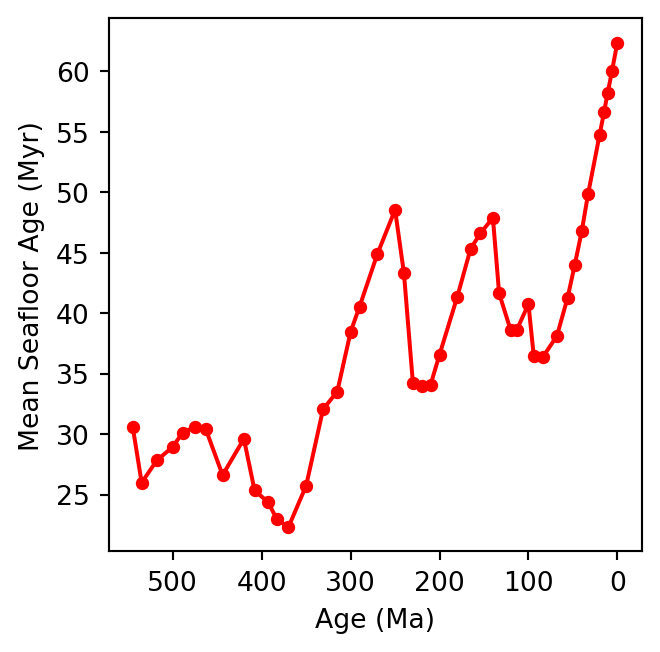
We are now going to check this for the entire Phanerozoic, as we did for the land and ocean areas. Again, we will simply create a loop that will calculate the mean value of every available raster. Let us use the same function as before, with an update for default parameters that are (for our demo) not going to change
from xml.etree import ElementTree as ETdef get_available_times( layer_name, base_url="https://geoserver.panalesis.org/geoserver/", workspace="panalesis_atlas", service_type ="WCS", service_version="1.0.0"): describe_url = (f"{base_url}{workspace}/{service_type.lower()}"f"?service={service_type}&version={service_version}"f"&request=DescribeCoverage&coverage={workspace}:{layer_name}" ) response = requests.get(describe_url) root = ET.fromstring(response.content) times =sorted(set( el.text for el in root.iter()if el.tag.endswith('timePosition') and el.text ))returnsorted(times)
Which we can now use to retrieve all available time steps, and retrieve each map, calculate its mean age value, and finally plot a timeseries chart of the mean age evolution:
layer_name ="seafloor_ages"times = get_available_times( layer_name=layer_name)results = {}for time in times: geological_age =int(time[:4]) -2000 wcs_url = construct_wcs_url( layer_name=layer_name, time=time ) data = requests.get(wcs_url).contentwith MemoryFile(data) as memfile:with memfile.open() as dataset: raster = dataset.read(1).astype(float) nodata = dataset.nodataif nodata isnotNone: raster = np.ma.masked_equal( raster, nodata )else: raster = np.ma.masked_invalid(raster) mean_age = raster.mean() results[geological_age] = {'sf_mean_age': float(mean_age)}del data, rasterages =list(results.keys())seafloor_ages = [results[age]['sf_mean_age'] for age in ages]plt.figure(figsize=(4, 3.5))plt.plot( ages, seafloor_ages, color='red', marker='o', markersize=4)plt.xlabel('Age (Ma)')plt.ylabel('Mean Seafloor Age (Myr)')plt.gca().invert_xaxis()plt.gca().set_box_aspect(1)plt.tight_layout()plt.show()
CautionTask
→ What do you observe ? Can you guess the reason for these variations ?
Multi-layer analysis
In the last two time-series we plotted (land/ocean area , seafloor ages), we only considered one input map at a time with the rasterio library. This is good, but what if we want to “pack” different sources together and derive insights from several layers ?
For this, we are going to use xarray, a Python library that deals with multidimensional arrays. An array is a data structure that stores a collection of elements of the same type, organized in a grid-like structure where each element can be retrieved using its position. In our case, as our maps share the same resolution and extent, the elements inside our array are the map pixels.
Organizing our data in arrays will prove very useful for combined analysis of several variables. Below is a function that creates an array from a WCS URL:
import xarray as xrimport rioxarraydef load_raster_as_dataarray(layer_name, time, name): url = construct_wcs_url( layer_name=layer_name, time=time ) data = requests.get(url).contentwith MemoryFile(data) as memfile:with memfile.open() as dataset: raster = dataset.read(1).astype(float) nodata = dataset.nodataif nodata isnotNone: raster[raster == nodata] = np.nan raster[~np.isfinite(raster)] = np.nan da = xr.DataArray( raster, dims=["y", "x"], name=name )return da
This function opens a raster from a WCS URL as we did before, but then creates an xr.DataArray class object to create a multidimensional array: two spatial dimensions (x and y, according to the pixel index) desrcibing the position (index) of each pixel.
We can then create three data arrays (one for each layer), for a given time:
The idea behind this construction is simply to get a dataset that has consistent coordinates and various pixel properties. The structure of our dataset will look something like:
Taking advantage of this simple structure, it is now easier to have a glance at all variables with one simple call:
for var in ds.data_vars:print(f"\n{var}:")print(f"mean: {float(ds[var].mean()):.2f}")print(f"std: {float(ds[var].std()):.2f}")print(f"min: {float(ds[var].min()):.2f}")print(f"max: {float(ds[var].max()):.2f}")
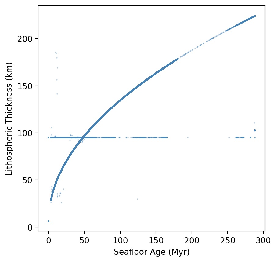
Now, we will have a look at the relationship between the seafloor age and the thickness of the lithosphere. Let’s do a simple plot that will show this relationship. We first need to do some pre-filtering of our data. The code below will (i) “flatten” our multidimensional array into a single dimensional one, (ii) discard non oceanic pixels, and (iii) discard any invalid pixels:
→ What do you observe ? Is the relationship coherent with what you would expect from your knowledge ?
→ Can you find a mathematical function that describes this trend? Try using numpy.polyfit to fit a curve to the data.
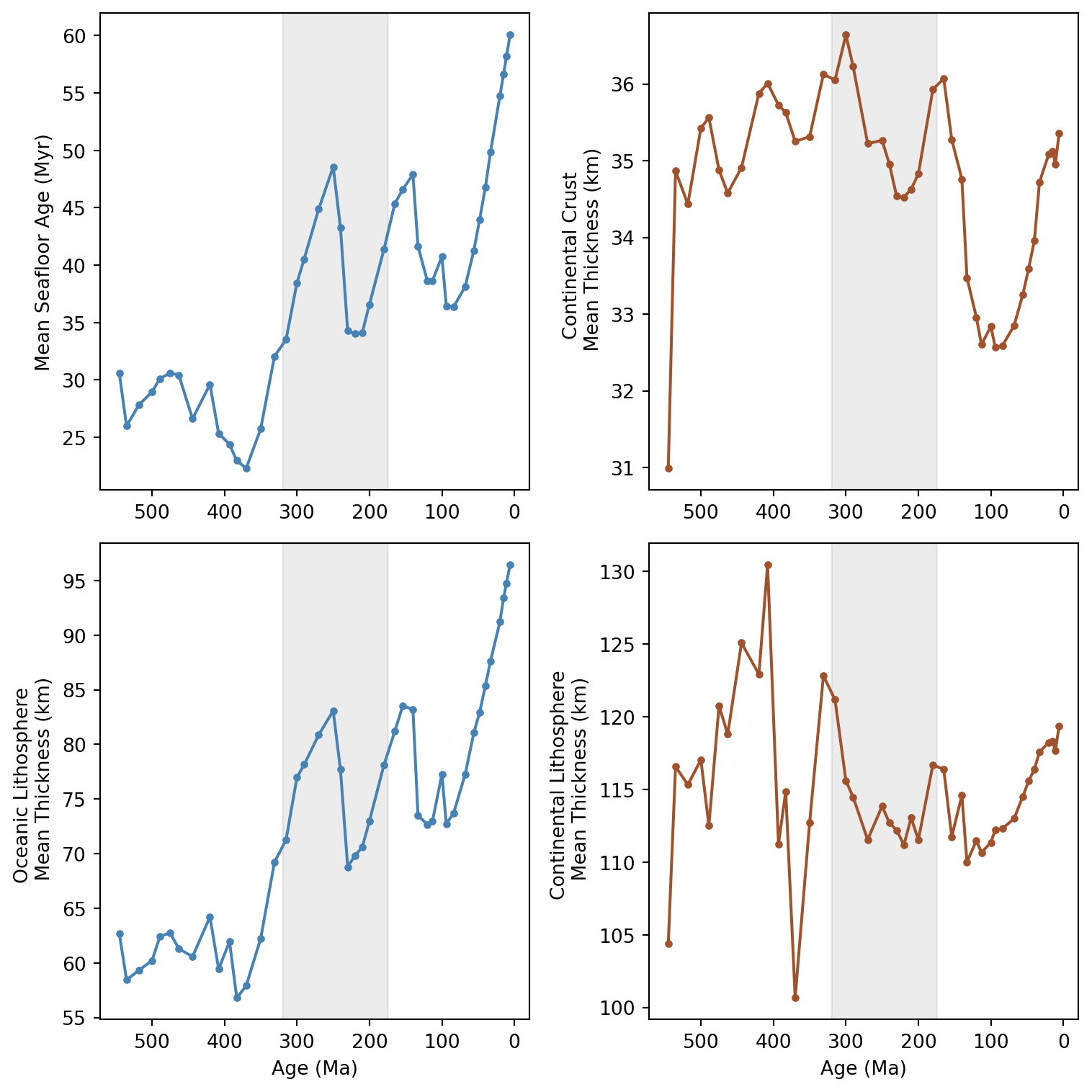
Now that we understand the relationship between seafloor age and oceanic lithosphere, we will extend our time-series visualization to continental crust and lithosphere thickness. As we will plot the entire Phanerozoic evolution, our previous approach to use xr.DataArray (single map) or xr.Dataset (multiple maps) for a single time-step is now limited. For this, we will use the very well known and widely used pandas Python library.
The structure of the code below should be now well known to you. We simply iterate through the time-steps listed in times. For each step, we load the seafloor age, crustal & lithospheric thickness as xr.DataArray, which we then combine into a xr.Dataset. We then discriminate between oceanic versus continental regions, based on whether or not the seafloor age raster value is valid or not.
The new aspect here is how we store the results. At the beginning of the code, you can see we create an empty list to store results, which we populate with the mean values for each time. After the loop, we create a pd.DataFrame containing all mean values from all ages.
Creating a pd.DataFrame allows us to pack our data in a tabular format: columns with names and rows (indices). This organization is used in all data science fields. Once we have our dataframe, it is very straightforward to plot the various time series.
For instance, the code below creates a figure with two rows and two columns. We can then arrange each subplot as we prefer. Notice how we simply access subsets of our dataframe to display them in each subplot.
→ Are there any interesting trends ? Do you notice some odd results ?
→ Using your knowledge about the supercontinent cycles, and the timing for formation/break-up of these supercontinents, do you see these cycles linked with the data we have ?
Bonus: Create a GIF with your maps
Finally, we will learn how to create an animated GIF to visualize one layer evolution through the Phanerozoic. For this we will need another two libraries called io and imageio, designed to deal with files management, and images and video files, respectively.
/tmp/ipykernel_4509/1600953094.py:53: DeprecationWarning: Starting with ImageIO v3 the behavior of this function will switch to that of iio.v3.imread. To keep the current behavior (and make this warning disappear) use `import imageio.v2 as imageio` or call `imageio.v2.imread` directly.
  return imageio.imread(buf)
GIF saved as: seafloor_ages_phanerozoic.gif
CautionTask
→ Play around with the code above and try to change some parameters (revert the time to have something going from the oldest age to present, adjust the duration of each map display, change the layer and symbology).
Final questions
What is the rationale behind writing functions to automate workflows ?
What does the histograms of 0Ma versus 100Ma tell us about the rate of oceanic seafloor production ?
Compare the properties of the data handling structures we usedinthis exercise: xr.DataArray, xr.DataSet, and pd.DataFrame. How are these complementary to handle geospatial layers and key stats ? Are you awayre about other structures ?
Using your knowledge about the supercontinent cycles, and the timing for formation/break-up of these supercontinents, do you see these cycles linked with the data we have ?
Links to useful libraries and tools
Python libraries
xarray A Python library for working with labeled multi-dimensional arrays, providing a Dataset structure that combines multiple variables sharing the same coordinate system.
rioxarray An extension of xarray that adds geospatial capabilities, enabling CRS-aware operations on raster datasets directly within the xarray framework.
pandas A Python library for data manipulation and analysis, providing a DataFrame structure that organizes tabular data with named columns and row indices.
io A Python standard library module for handling Input/Output (I/O) operations, such as reading data in or writing data out.
imageio A Python library for reading and writing a wide range of image and video formats, offering a simple interface to load image data as NumPy arrays.